Showing posts with label Digital Painting. Show all posts

Wednesday, 8 May 2013

Misty Dawn


Reflection and Analysis

As in my recent painting "Harmony in Blue and Grey - Soft Tides" I chose a very soft lighting for the image.  This image lives form its lighting and is dominated by greys, which are toned by the two complementary colours blue and orange to make the "colourless" painting more interesting and aesthetic. As also I added some textures of traditional brushes in the sunlit areas (top right) to support the painterly feel of the whole image, but only slightly to add some variation to the painting. The soft brush must still outweigh to keep the soft feel.
  • Dreamlike atmosphere
  • Soft lighting
  • "Beautiful Grey"
  • Monochrome image with a teinte of orange
  • Low value and colour contrast
    • Soft transitions from light (top) to dark (bottom)

Painting Process

Used some photos of a seagull beginning its flight I took a while back and cropped them together. The shortly before dusk lighting when I took the photos lights up the wings nicely which inspired me to make this the focal point of the image. 
After layering the birds close to each other I cropped the image to landscape view as it fit the composition better. Now I begun to soften up the background as I wanted to create a very soft painting with the bird furthest to the left hardly visible and the closer they get to the light source (to the top right out side of the picture somewhere), the more visible they become. I therefore also overlayed a gradient from light to dark over the whole image to emphasize the lighting and help unify and further soften up the image. 

Friday, 26 April 2013

Harmony in Blue and Grey - Soft Tides

For "Harmony in Blue and Grey - Soft Tides" I wanted to achieve a very dreamy and soft atmospheric piece of art contrasting the last digital painting, "Up the Ragged Rocks", which consisted of many rough textures and angular shapes. To achieve this soft feel I primarily used grey tones, to which I added blue colour for the water, as well as soft lighting techniques with only a few highlights on the town to make it stand out from the otherwise flat image. The scene is inspired by Mont Saint-Michel, a rocky tidal island, located in Normandy, France.


Reflection & Analysis
  • "Beautiful grey"
  • Harmonious scene
  • Overall low colour contrast and value contrast
  • Visual style follows subject matter
    • soft brush strokes of the tide slowly going out
  • The shadow helps give the town volume and let's it stand out from the otherwise flat environment/background
Cons
  • The perspective of the town is incorrect. There should be more of a top view on the town as the horizon is very high in the image (somewhere above the picture).
  • The town might stand out too much from the rest of the image and destroy the unity/rhythm/balance of this particular painting as I was aiming for a very flowing and united dreamy look. 
    • In previous development and refinement stages I did already reduce the highlights on the town by lowering the value and colour contrast though.


Painting Process
Started off by blocking in colours and creating the overall mood and atmosphere of the piece as this will be the top priority of the image. I had my colour scheme pretty much set from the beginning as I was also using some reference images and simplifying their colours to these core colours to maintain a more monochrome and harmonious feel
Next I started to clean up the piece and soften transitions as well as add some detail to the town area. 
The main work on this step was creating detail on the town itself and improving its perspective (which is still a bit off in the end). Afterwards I darkened the foreground which resulted in more depth in the painting. 
As I was going for a very soft feel I decided to lighten up the foreground again and lower the value and colour contrast of the town and in general of the painting as well as soften up areas by making the the colour/value transitions softer.


Some Colour and Lighting Variations
For this version I merely changed the hue to a more purple/blue colour theme which is still very harmonious as I only increased the value contrast slightly.
In this nocturne version however I increased the value contrast as well as the saturation which is creating a more dynamic image. By darkening the foreground and adding this contrast more depth is created and the town itself really reads strongly compared to the original version. The top part of the painting now also has a very shiny blue glow which adds a nice effect. It is hard to choose between the different versions as they all create a different vibe and expression
The calm and misty versus the slightly surreal versus the clear and contrasty.

Sunday, 21 April 2013

Up the Ragged Rocks


Reflection and Analysis

For this painting I went for a very texture heavy and sketchy feel to portray the roughness of the scene. 
  • Connection between art style and subject matter
  • Composition: main subject in verticle line of the rule of thirds

Top Version
The top version uses clear and high saturated colours and still throws off a quite friendly impression of the environment in contrary to the bottom version. 
  • High colour contrast and use of complementary colours
  • Warm colours dominating

Bottom Version
In the bottom version there is far less colour contrast which lets the whole image merge together as whole far more. It therefore creates more unity. The lower saturated colours and the unhealthy sky colour as well as the now cool colours for the rocks (especially in the shadows) create a much darker atmosphere than the upper image does. The sky seems almost like industrial smoke now and covers the mountains creating a sense of danger in the air.
  • Low colour contrast
  • Cool colours dominating
  • Unity of the image due to a fairly monochrome colour scheme 


Different Alterations

Here are some further colour variations that I created to test different atmosphere and lighting effects.

 Painting Process

This is one of the few paintings I started off without any reference or subject in mind. I just sat down and started with a empty canvas and wanted to see the result. My initial plan after setting the basic composition and colour theme was to use the clouds as sort of lines pointing towards the mountain to strengthen it's importance.
Later on I felt there was too little of a texture in the painting and that it started to come across a bit boring. So I tried to add different kind of textures (through texture brushes in Photoshop (not photos)) and create a more realistic lighting. The clouds were also a bit too much as the mountain was already in the rule of thirds and the only real object to look at. To create more balance I changed the clouds therefore. Finally I adjusted the final colour and lighting in the scene.

Sunday, 7 April 2013

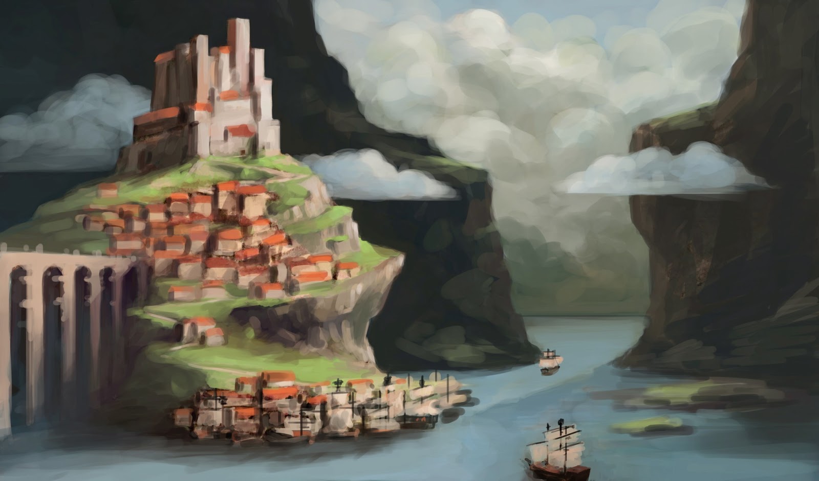
Gateway Artwork Revision

Reflection

In this experiment I tried to create a more visually engaging and interesting art artefact through abstraction, adding textures and creating new patterns. The darker edges lead the eye to the centre of the image. The clouds form a smoother transition and retain the unity of the artwork. Compositionally the red roofs are now the alone main focus of the image, as the horizon in the previous version was distracting the viewer offering a second focal point. The red roofs also brake the overall feeling of division in the painting (stronger than the clouds do), The town and castle also follow the rule of thirds and avoid being placed in the centre of the image. 
  • Abstraction through texture layers and spatial division
  • Simpler composition emphasizes main focal point
    • Town and castle
    • Created through colour contrast
      • Complementary colours green and red
    • High value contrast of castle against background
  • Textures create interesting atmosphere and mood, as well as unitiy in the image
    • The darker the area the harder the texture overlay
  • Division into 3 parts
    • The outsides being darker leading the eye to the centre through the clouds
  • Retaining unity balance
    • Clouds function as transition as well as town


Comparison

Tuesday, 2 April 2013

Gateway

Reflection & Analysis
  • Realistic depiction versus abstraction
  • Loose painterly brush strokes
    • Larger brush strokes towards the borders of the image and less important areas
  • Visible canvas textures to create traditional feel in a digital painting
  • Colour contrast allows the town to stand out
    • Complementary colours (red against green)
  • Composition:
    • Rule of thirds guides viewers again to the town


Painting Process

Friday, 22 March 2013

Water Lily Pond - Day and Nocturne

For these two digital paintings I started off with a hand-drawn traditional sketch and worked solely an "charcoal brush" in Photoshop. I also stuck to large brushes at first and even in the end stuck to fairly large brushes to avoid getting stuck in details. The goal of this artwork was the creation of atmospheric scenery. It's supposed to portray elements of romantic art, which is why I chose less saturated colours and despite the bigger defining brush strokes a soft feeling, especially in the day version.
The nocturne version focuses more on reflections in the pond. The small star reflections were also created with a round soft brush instead of a bigger charcoal brush which creates the illusion of more detail in this area and follows draws the viewers eye to it.


Reflection and Analysis

After the last artworks being quite dynamic I chose to paint a more static and controlled image this time. Beneath is the sketch I started off with. It is a bit more dynamic than the final painting due to more value contrast and more diagonal lines such as the water on the left side which I turned in to a horizontal line in the final painting.

Features of the Two Final Digital Paintings 
  • Soft and romantic feel
  • Rhythm, Balance and Unity
    • Many straight, horizontal and vertical lines create a quite controlled and static pattern.
  • Solely use of "charcoal brush" and larger brush strokes (except for stars in night version)
  • Low colour contrast
    • Though the house still sticks out nicely through the red/purple roof and green surroundings.
      • Complementary colours 
  • Value contrast 
    • Dark fore- and background allows the eyes to focus on the mid-ground.
    • The white house further stands out due to the high value contrast against the dark background.

Wednesday, 13 March 2013

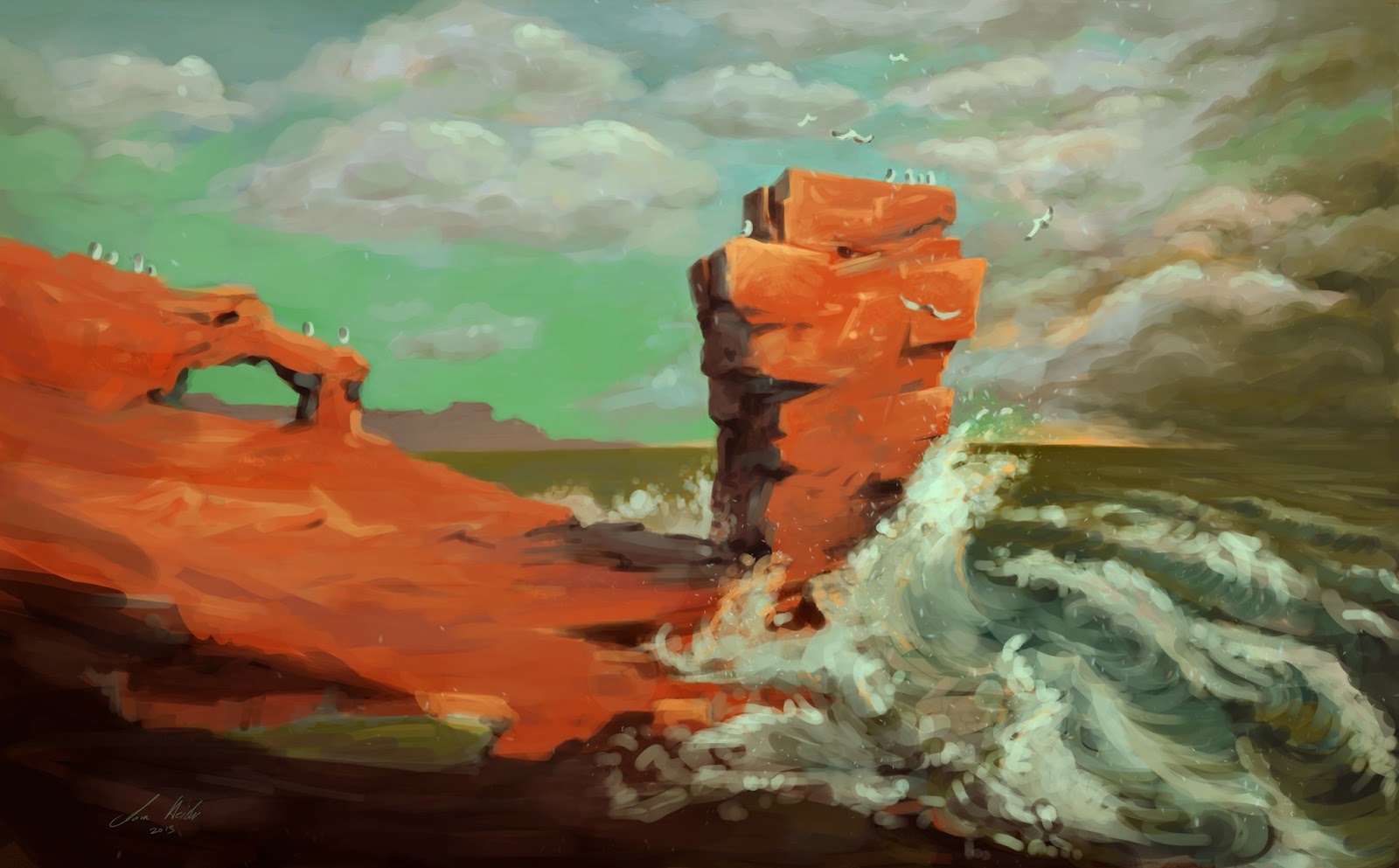
A Storm’s Approach – The Red Cliffs near Arbroath

Background Story

"A Storm’s Approach – The Red Cliffs near Arbroath" is inspired by personal experiences from a day trip to Arbroath. There was a freezing cold wind coming in from the sea and the water itself was just as cold. Therefore the water is depicted dangerously with large waves and cool colours, whereas the warm colours of the land resemble the safety and warmth the rocks provided. In the sun they would heat up nicely. 
  • Emotional response to personal experience


Painting Process

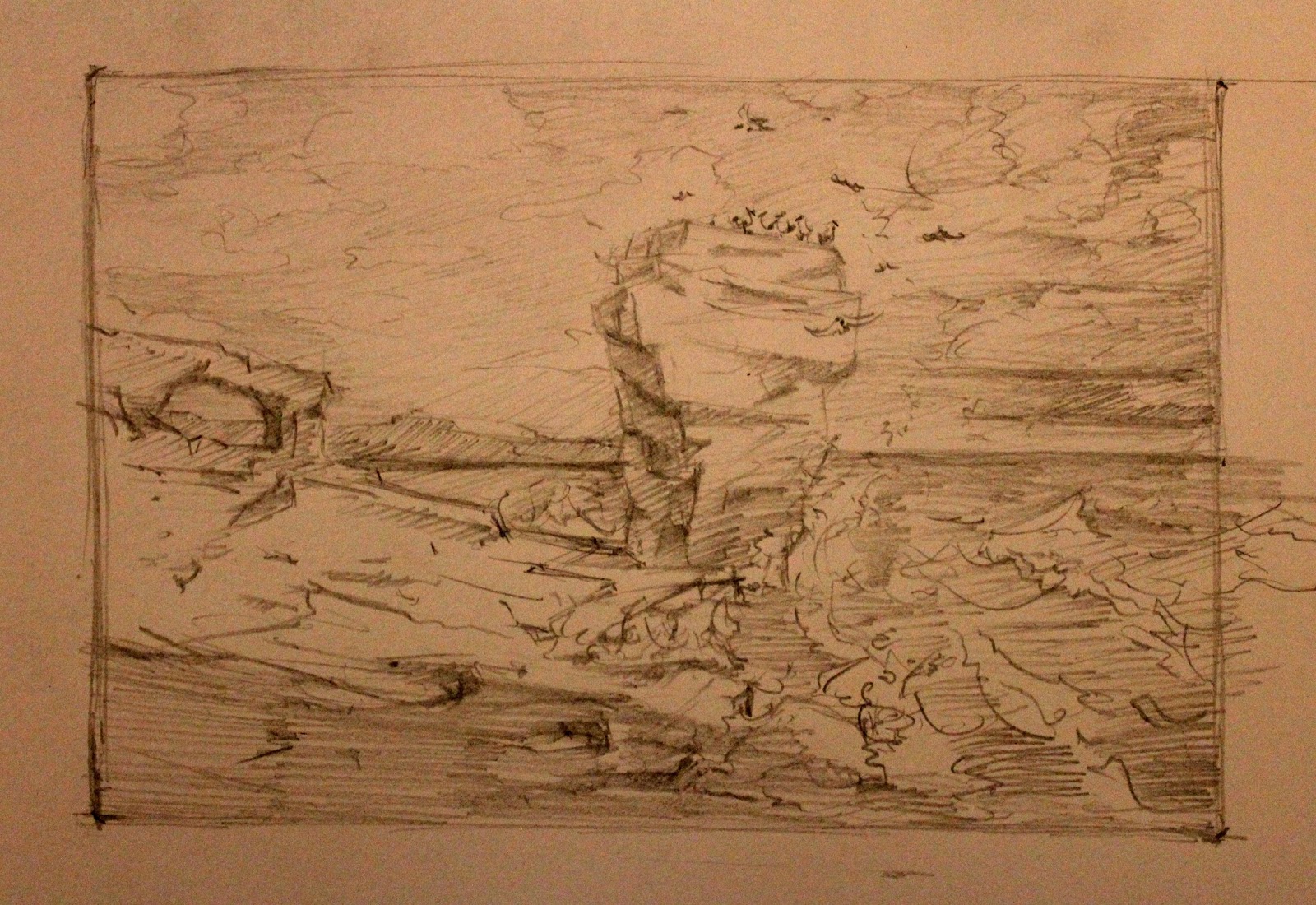
In contrary to the last digital painting I already had an exact idea and vision of the final art piece as I previously made an accurate sketch of the scene which I scanned in to continue the work digitally as one can see below. 
After painting in the blue-greenish sky I wanted to make the rocks, the main subject of the painting, really stand out. Therefore I chose its complementary colour and the strong shadows, as well as the white foam from the waves smashing into the rocks to create both high colour and value contrast.
In the final stages more detail was added and the colour and value contrast was also further enhanced. To create the active and dynamic right third I spent more time on the clouds and see to create this chaotic and darker atmosphere of the storm rolling in. 

Reflection
  • Colour Contrast
    • High colour contrast between the main subject (orange/red) and the background (blue/green)
    • This was an artistic choice as these colours would not occur like that in real life in this scene. To keep this colour theme I also chose to paint a murky green looking ocean.  
  • Complementary Colours
    • Orange/Red against Blue/Green
    • As well as the yellow light from the horizon to the purple taint in the clouds and some shadows in the image.
    • As learnt from some research I now know that complementary colours are in the shadows of an image. This is why I chose to add some blue e.g. to the shadows of the main rock

  • Value Contrast
    • High value contrast due to the strongly depicted sunlight creating shadows on the main subject as well as 
      the small yellow lighting from the horizon which contrast the clouds and lets them stand out just this bit more. This way the eye is drawn more to this part of the painting, which is the actual story/theme, as the title reveals, the storm approaching.
  • Composition
    • Rhythm, Balance & Unity
      • Controlled versus dynamic
      • I used the rule of thirds to enhance the effect of the painting
        • The left two thirds are very static and calm whereas the right third has the complete opposite effect with curves and diagonal lines from the waves as well as the strongest value contrast in the image with the sun just still shining on the waves smashing up against the rock creating this extra sense of drama and action.
        • The transition in the sky from left to right as well as the slightly bent horizon connect the two parts nicely though and create unity in this piece. This controlled horizontal line also creates a bit more balance and calmness.


Criticism


  • Though I wasn't going for a completely realistic depiction and feel of the image I noticed that I added a second light source with the yellow sun slightly shining through the clouds on the horizon. This makes no sense as the sun is shining from the front/right as the shadows of the main subject clearly suggest.
  • One lecturer also suggested that the left part with the large orange "blob" which covers a lot of space might be a bit too much and too abstract. Possibly a bit more detail or texture would be beneficial here.

Monday, 11 February 2013

Nocturne in Blue and Gold - The Tay Train

My attempt at a more dreamlike and loose painting to capture the atmosphere and lighting of the scene. Inspired by Theodor Fontane's ballad "the Tay Bridge".

"The Tay Bridge" by Theodor Fontane

Extract:
The husband and wife, with an anxious eye,
Look out to the south and of misgivings sigh,
Keeping a lookout and praying for a light,
Which o'er the water advances bright,
Proclaiming, "In spite of night and driving rain,
I come, I, the Edinburgh train."

(The complete ballad can be found here http://johnmaynard.net/TayEnglish.pdf)


Aesthetic Vision

The style of the digital painting "Nocturne in Blue and Gold - The Tay Train" was influenced by several factors. The famous British painter J. M. W. Turner definitely had one of the strongest influences. I particularly used Turner's painting "Rain, Steam and Speed - The Great Western Railway" as reference, not only in terms of style and expression, but also in terms of composition as you can see and compare beneath.
Rain, Steam and Speed - The Great Western Railway (Turner, 1844)
Nocturne in Blue and Gold - The Tay Train (Heisler, 2013)

The sketch for "Nocturne in Blue and Gold Valparaiso Bay" by James McNeill Whistler was also a great inspiration in terms of colour scheme, atmosphere and the gold lights Whistler used on the boats and left hand side.
Sketch for Nocturne in Blue and Gold Valparaiso Bay (Whistler, 1866)

Painting Process

Quick blocking in of shaped and overall atmosphere of the painting -> dark and cool colours.
I then started to redefine the exact composition and add in more colours to the train to make it stand out.
Between the last progress step and this final painting there has been a lot of work and time invested. The colours are now optimized (complementary colours: blues against orange) as well as the details in the reflection of the water.

Reflection

Pros
  • The painting process worked out well as I kept it loose and begun with basic shapes to be more flexible and to not be afraid of making big changes. After I was happy with the design I was able to add in details in the parts of the painting that had to read. By keeping the other parts less detailed the focus on the train was further strengthened.
  • Using the complementary colour orange on the train against the blue surroundings to create more dynamism and stand out more also worked out nicely.
  • A further positive note is the overall feel and atmosphere as well as the the water reflections of the lights from the train that add just that bit extra to the whole scene and make it more interesting.

Cons
  • I noticed that the perspective is a bit off. This is mainly because I just started painting and was guessing/estimating the about perspective. This will hopefully get more accurate with more practice.
  • It would be nice to have some more textures inside the painting to create the illusion of more happening and support the dynamic story of the scene.
  • In the end I spent several days remastering the picture and redrawing parts. So overall I still need  to speed up the "production" time of my painting, though it is of course good to have a look at paintings after a break/a few days later as the mistakes become visible and one is able reflect on the paintings. 

Friday, 11 January 2013

Sketch - "Prostitution"


After scanning in the sketch I overlayed it with textures and adjusted contrasts.