Background Story
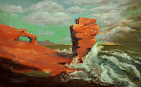
"A Storm’s Approach – The Red Cliffs near Arbroath" is inspired by personal experiences from a day trip to Arbroath. There was a freezing cold wind coming in from the sea and the water itself was just as cold. Therefore the water is depicted dangerously with large waves and cool colours, whereas the warm colours of the land resemble the safety and warmth the rocks provided. In the sun they would heat up nicely.
- Emotional response to personal experience
Painting Process
In contrary to the last digital painting I already had an exact idea and vision of the final art piece as I previously made an accurate sketch of the scene which I scanned in to continue the work digitally as one can see below.
After painting in the blue-greenish sky I wanted to make the rocks, the main subject of the painting, really stand out. Therefore I chose its complementary colour and the strong shadows, as well as the white foam from the waves smashing into the rocks to create both high colour and value contrast.
In the final stages more detail was added and the colour and value contrast was also further enhanced. To create the active and dynamic right third I spent more time on the clouds and see to create this chaotic and darker atmosphere of the storm rolling in.
Reflection
- Colour Contrast
- High colour contrast between the main subject (orange/red) and the background (blue/green)
- This was an artistic choice as these colours would not occur like that in real life in this scene. To keep this colour theme I also chose to paint a murky green looking ocean.
- Complementary Colours
- Orange/Red against Blue/Green
- As well as the yellow light from the horizon to the purple taint in the clouds and some shadows in the image.
- As learnt from some research I now know that complementary colours are in the shadows of an image. This is why I chose to add some blue e.g. to the shadows of the main rock

- Value Contrast
- High value contrast due to the strongly depicted sunlight creating shadows on the main subject as well asthe small yellow lighting from the horizon which contrast the clouds and lets them stand out just this bit more. This way the eye is drawn more to this part of the painting, which is the actual story/theme, as the title reveals, the storm approaching.
- Composition
- Rhythm, Balance & Unity
- Controlled versus dynamic
- I used the rule of thirds to enhance the effect of the painting
- The left two thirds are very static and calm whereas the right third has the complete opposite effect with curves and diagonal lines from the waves as well as the strongest value contrast in the image with the sun just still shining on the waves smashing up against the rock creating this extra sense of drama and action.
- The transition in the sky from left to right as well as the slightly bent horizon connect the two parts nicely though and create unity in this piece. This controlled horizontal line also creates a bit more balance and calmness.
Criticism
- Though I wasn't going for a completely realistic depiction and feel of the image I noticed that I added a second light source with the yellow sun slightly shining through the clouds on the horizon. This makes no sense as the sun is shining from the front/right as the shadows of the main subject clearly suggest.
- One lecturer also suggested that the left part with the large orange "blob" which covers a lot of space might be a bit too much and too abstract. Possibly a bit more detail or texture would be beneficial here.


No comments:
Post a Comment