Friday, 29 March 2013

Abstract White - The Oil Painting Canvas Effect

"Abstract White" began with the same photo as the "Solar System Series". I wanted to create a counter piece to the dark images in the original abstract pieces. So I revisited them and turned out this new version. I started off by duplicating the layer and setting the layer to "Exclusion" which already changed the complete atmosphere and mood. Then I painted over parts to create some new structures and textures as well as create some more balance and remove others. I wanted to achieve a oil painting feeling in the end through different Photoshop brushes and filters. 

Personal Interpretation
While creating this piece I imagined the bottom third to be a landscape. It resembles some grassy hills with bushes on them and the bright sun (light source) is overpowering the whole scene. The vegetation is very dried out due to the heat of the sun in this area. The vertical light beam from the sun leads directly down to the environment and underpins this idea.

Thursday, 28 March 2013

Life Drawing

 Sepia ink - 10 mins
       Charcoal - 15 mins                                         White Chalk - 15 mins
 Charcoal and sepia ink - 30 mins
Charcoal and sepia ink - 10 mins

Tuesday, 26 March 2013

Abstract Solar System Art Series

The aesthetics in these experimental images is achieved through the placement and balance of different shapes, forms, textures, lighting and colour. Therefore the composition played an important role. I also avoided placing the main light source or focal point directly in the centre of the image, as by placing it on 2/3 of the horizontal length e.g. the image becomes more dynamic and interesting (rule of thirds).

Red Solar System

Black Hole

Rainbow Effect

Development Process
This abstract series began with some photo editing of random photos I had taken of a digital painting I was working on at the time on my laptop screen. So most of the textures are in fact scratches, fingerprints and reflections. Below one can see the early development stages until it finally loses the photographic context

Sunday, 24 March 2013

Honours Workshop Diary 16 - Creating a Glossary of Art Terms

The agenda for this week was to create a glossary of art terms to improve my analytical capabilities and expand my knowledge in the field of craftsmanship as well as improve my observational skills to be able to identify more elements and structure in an art piece.

So below is a list of terms I put together with help from different sources and art theory literature.

General:
All prima
Atmospheric perspective
Blending
Broken colour
Brushwork
Calligraphy
Cartoon
Chiaroscuro
Complementary colours
Composition
Gesso
Glaze
High key
Key
Low key
Medium
Modeling
Negative space
Paint
Painterly
Palette
Plein air
Shade
Squaring up
Study
Support
Tint
Underpainting
Value
Wash
Wet on Wet

Applications:
Line
Edge
Shape
Size
Texture
Direction
Gradation
Repetition
Contrast
Pattern

Effects:
Balance
Harmony
Unity
Dominance
Movement
Depth
Closure
Colour & Value key
Echo

Friday, 22 March 2013

Water Lily Pond - Day and Nocturne

For these two digital paintings I started off with a hand-drawn traditional sketch and worked solely an "charcoal brush" in Photoshop. I also stuck to large brushes at first and even in the end stuck to fairly large brushes to avoid getting stuck in details. The goal of this artwork was the creation of atmospheric scenery. It's supposed to portray elements of romantic art, which is why I chose less saturated colours and despite the bigger defining brush strokes a soft feeling, especially in the day version.
The nocturne version focuses more on reflections in the pond. The small star reflections were also created with a round soft brush instead of a bigger charcoal brush which creates the illusion of more detail in this area and follows draws the viewers eye to it.


Reflection and Analysis

After the last artworks being quite dynamic I chose to paint a more static and controlled image this time. Beneath is the sketch I started off with. It is a bit more dynamic than the final painting due to more value contrast and more diagonal lines such as the water on the left side which I turned in to a horizontal line in the final painting.

Features of the Two Final Digital Paintings 
  • Soft and romantic feel
  • Rhythm, Balance and Unity
    • Many straight, horizontal and vertical lines create a quite controlled and static pattern.
  • Solely use of "charcoal brush" and larger brush strokes (except for stars in night version)
  • Low colour contrast
    • Though the house still sticks out nicely through the red/purple roof and green surroundings.
      • Complementary colours 
  • Value contrast 
    • Dark fore- and background allows the eyes to focus on the mid-ground.
    • The white house further stands out due to the high value contrast against the dark background.

Saturday, 16 March 2013

Crit Presentation Feedback

Integrating Previous Presentations' Feedback

The key points I was advised to optimize/change for this presentation were as follows:
  1. Define aesthetic criteria
  2. Explain goals and meaning of my artwork
  3. Summarize aesthetic journey and further development plans
  4. Presentation length (last one too short)
So beneath is my approach on implementing the advice:
  1. The presentation starts with some thoughts on my aesthetic vision and developing criteria which is divided into 12 key points. These are still quite broad and cover a lot of content at the time. The most important ones to me are slowly crystallizing though and will be defined and explained in my final presentation.  

    1. I then continue with some environment sketches and explain my thoughts and intent in them. The sketches serve as a foundation for some of the paintings I did and am planning to do covering different themes such as personal meaning and emotive expression, composition and balance, as well as light and colour theory.
    2. For the main artwork of this presentation, "A Storm is Brewing", I added more critical analysis and reasoning to explain the development process and meaning of the art work. This also included inspirational artwork that influenced the painting.
  2. While presenting the digital painting "A Storm is Brewing" I will try to summarize my aesthetic journey and state how this painting has expanded my vision on art and how it will influence my next painting. 
  3. I also added photography research and analysed individual photographs on composition, lighting and colour, which adds some research and a new medium than the up until now solely painting examples. Also, the alterations mentioned in the previous points added content and I should have a good presentation length now.


Feedback
Pros
  • Good presentation length
  • Further improvement of craftsmanship skills
  • Good presentation of the main art piece in terms of personal meaning and expression as well as an explained analysis
  • Liked the integration of photography research
Cons
  • The "orange blob" space on the left half of "A Storm is Brewing" might be too abstract and saturated.
  • Create a proper description of my personal aesthetic journey

Wednesday, 13 March 2013

A Storm’s Approach – The Red Cliffs near Arbroath

Background Story

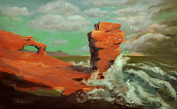
"A Storm’s Approach – The Red Cliffs near Arbroath" is inspired by personal experiences from a day trip to Arbroath. There was a freezing cold wind coming in from the sea and the water itself was just as cold. Therefore the water is depicted dangerously with large waves and cool colours, whereas the warm colours of the land resemble the safety and warmth the rocks provided. In the sun they would heat up nicely. 
  • Emotional response to personal experience


Painting Process

In contrary to the last digital painting I already had an exact idea and vision of the final art piece as I previously made an accurate sketch of the scene which I scanned in to continue the work digitally as one can see below. 
After painting in the blue-greenish sky I wanted to make the rocks, the main subject of the painting, really stand out. Therefore I chose its complementary colour and the strong shadows, as well as the white foam from the waves smashing into the rocks to create both high colour and value contrast.
In the final stages more detail was added and the colour and value contrast was also further enhanced. To create the active and dynamic right third I spent more time on the clouds and see to create this chaotic and darker atmosphere of the storm rolling in. 

Reflection
  • Colour Contrast
    • High colour contrast between the main subject (orange/red) and the background (blue/green)
    • This was an artistic choice as these colours would not occur like that in real life in this scene. To keep this colour theme I also chose to paint a murky green looking ocean.  
  • Complementary Colours
    • Orange/Red against Blue/Green
    • As well as the yellow light from the horizon to the purple taint in the clouds and some shadows in the image.
    • As learnt from some research I now know that complementary colours are in the shadows of an image. This is why I chose to add some blue e.g. to the shadows of the main rock

  • Value Contrast
    • High value contrast due to the strongly depicted sunlight creating shadows on the main subject as well as 
      the small yellow lighting from the horizon which contrast the clouds and lets them stand out just this bit more. This way the eye is drawn more to this part of the painting, which is the actual story/theme, as the title reveals, the storm approaching.
  • Composition
    • Rhythm, Balance & Unity
      • Controlled versus dynamic
      • I used the rule of thirds to enhance the effect of the painting
        • The left two thirds are very static and calm whereas the right third has the complete opposite effect with curves and diagonal lines from the waves as well as the strongest value contrast in the image with the sun just still shining on the waves smashing up against the rock creating this extra sense of drama and action.
        • The transition in the sky from left to right as well as the slightly bent horizon connect the two parts nicely though and create unity in this piece. This controlled horizontal line also creates a bit more balance and calmness.


Criticism


  • Though I wasn't going for a completely realistic depiction and feel of the image I noticed that I added a second light source with the yellow sun slightly shining through the clouds on the horizon. This makes no sense as the sun is shining from the front/right as the shadows of the main subject clearly suggest.
  • One lecturer also suggested that the left part with the large orange "blob" which covers a lot of space might be a bit too much and too abstract. Possibly a bit more detail or texture would be beneficial here.

Tuesday, 12 March 2013

Environment Sketches - Adding Value and Lighting Quickly

I Added some value and basic lighting to some environment sketches out of my sketchbook to get a better sense of atmosphere. I therefore scanned in the sketches and opened them in Photoshop. I now added a layer and set the layer mode to "Overlay". After colouring over the basic value/lighting of the image I would again create a new layer and add the picture frame. Then the sketch name on a separate layer again. This was the repetitive process for each of the images below.
Sketches

Monday, 11 March 2013

Colour and Value Contrast - A Day Trip to the Red Cliffs near Arbroath

Where better than Arbroath to capture some high colour contrasts between the red/orange cliffs and blue sky on a sunny day along the coastline. These complementary colours came out nicely in some of the photographs and accomplish some strong images. Along with the colour  I also paid close attention to the compositional elements by following the rule of thirds and other aspects in many of the pictures. This also helped create aesthetically pleasing images by proportioning the colours to each other.


Colour Contrast

The left image has a very high colour contrast due to the sunlight shining on the abbey. The orange bricks jump out from the bright blue sky in the background. The right picture on the other hand has a much lower saturation and comes across much more balanced and united. A further difference is that the left image is dominated by warm colours whereas the right image is dominated by cold colours
The white snow in the right photograph creates a fairly strong value contrast though and keeps the image from turning too calm/harmonious.

Composition
In the two images below core features were composed on the thought lines of the rule of thirds. The rule of thirds helps organize compositions and guide the eye. In the left picture the lines form a border on the horizon and vertically it separates the land from sea.
The right picture especially uses the horizontal line to divide the upper third from the lower third. As the lower is very dynamic and the top third in contrary very balanced and calm.  
The dynamic impression of the photograph beneath is created through diagonal lines, patches and varying spaces between shapes and creates a sense of activity.

High Value Contrast
The two images beneath have both a high value contrast as well as colour contrast due to the complementary colours orange and blue.

Friday, 8 March 2013

Honours Workshop Diary 15 - Reflection on Tonalism

After extensive research into tonalism I made a summary of the main trademarks of this expressive style. Especially the mystical, dreamy effect the layering often causes fascinates me a lot and is very aesthetic. I'm afraid this can not be implemented into my digital art though as it is alone a traditional effect that can be achieved in its practical existent from. However it is possible to work with different opacities in the digital medium which also allows the creation mystical impressions.  
  • Landscape art: subdued, profound, and spiritual
  • Intimate, poetic and expressive style of landscape art, relying on soft-edged broadly painted tonalities to communicate emotion
  • Neutral palette of predominantly cool colours
  • Technique of glazing, the layering
  • Mystery, dream, memory, and imagination
  • Atmosphere is both palpable and evocative of poetic and meditative states.